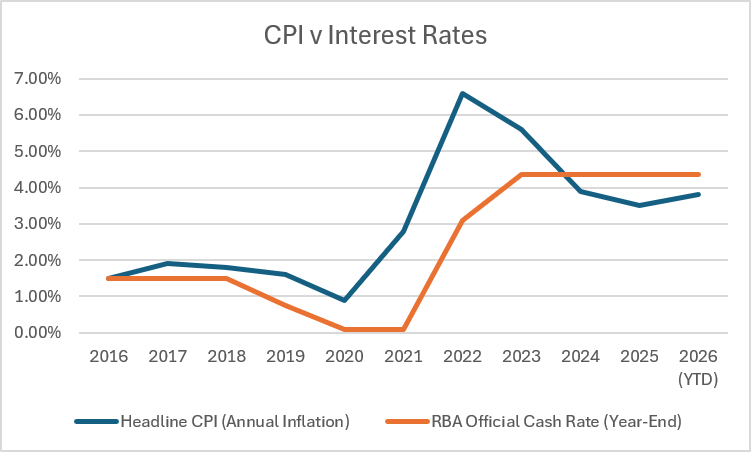
Inspect the following graph. See if you can interpret the informaton shown.
https://ajmblogger.com/wp-content/uploads/2026/08/image-3.png

The source sheet I included identifies: Australian Government Budget 2026–27, Statement 11 for historical payments and receipts; MYEFO 2024–25, Appendix E, Table E.11 for real per-capita payments and taxation; ABS National Accounts for real GDP; ABS National, State and Territory Population for population; and ABS productivity statistics for GDP per hour worked. The latest ABS population release reports 27.80 million people at December 2025 and annual population growth of 1.5%.
A more readable discussion is found next.
Australia’s economy is considerably larger than it was a decade ago. But that simple statement conceals a much less impressive story.
Since 2016–17, real GDP has increased by about 21 per cent. Population, however, has increased by around 14 per cent. Once population growth is taken into account, the increase in real output per Australian is only about 6 per cent.
Even more striking is productivity. Output per hour worked has barely increased over the period.
Put these measures beside government taxation and expenditure and an interesting picture emerges.

Australian real GDP, population, real GDP per capita, real government payments per capita, real taxation per capita and labour productivity, 2016–17 = 100]
Sources: Australian Bureau of Statistics, Australian National Accounts; ABS National, State and Territory Population; ABS productivity statistics; Australian Government Budget papers and MYEFO. Author’s calculations. All series indexed to 2016–17 = 100.
GDP is useful for measuring the size of an economy, but it is a poor measure of whether the average person’s economic circumstances are improving.
Australia illustrates the distinction particularly well.
Real GDP increased substantially over the decade, but so did the number of people sharing that output. The gap between the GDP and population lines on the graph therefore matters more for living standards than the GDP line by itself.
Real GDP per capita increased only modestly.
This does not mean Australians are only 6 per cent “better off”. GDP per capita is not a complete measure of welfare. It says nothing directly about the distribution of income, housing costs, environmental quality, unpaid work or the quality of public services.
But it does tell us that much of Australia’s headline economic expansion has come from having a larger population rather than producing dramatically more for each Australian.
The government figures tell another part of the story.
Real Australian Government payments per person rose sharply during COVID as extraordinary support measures were introduced. That spike subsequently unwound, as it should have.
More interesting is where expenditure settled afterwards.
By 2025–26, real government payments per person are roughly 17 per cent above their 2016–17 level.
Real taxation per person has followed a different path but arrives at a remarkably similar result: approximately 17 per cent higher than in 2016–17.
This should not be interpreted as demonstrating that increased government spending caused Australia’s weak productivity performance. The graph establishes no such causal relationship.
It does, however, raise a legitimate public-policy question.
Australians are contributing substantially more tax per person in real terms and governments are spending substantially more per person. What additional economic and social outcomes are we receiving for that increased commitment of resources?
That is a question worth asking regardless of one’s political persuasion.
The most concerning line on the graph is perhaps the least dramatic visually: labour productivity.
Output per hour worked is barely above where it was in 2016–17.
Productivity matters because sustainable increases in real wages and living standards ultimately depend heavily on our ability to produce more value from each hour of work.
Population growth can make GDP larger. Higher commodity prices can increase national income. Governments can tax and redistribute income.
None of these, by themselves, ensures continuing improvement in living standards.
Productivity growth provides something fundamentally different: the capacity to produce more without simply requiring proportionately more labour.
Australia has struggled to achieve that.
The unusual movements during the pandemic should also make us cautious about reading too much into individual years. Changes in the composition of employment and hours worked temporarily affected measured productivity. The longer trend is much more important.
And that trend is weak.
Political debate frequently focuses on whether GDP is growing, whether government spending should increase or decrease, and whether taxes are too high or too low.
Perhaps these are not the most useful starting questions.
A better question may be:
What additional value are Australians receiving from the additional resources being used?
If population rises substantially but GDP per person barely moves, economic growth alone is not enough.
If taxation and government spending per person rise substantially but productivity barely changes, simply arguing about the size of government misses an important part of the problem.
And if productivity remains stagnant, governments eventually face increasingly difficult choices between taxation, services, deficits and household living standards.
Australia has certainly grown during the past decade.
The more important challenge is ensuring that the next decade produces substantially more growth per Australian and per hour worked, rather than simply a larger economy.
Bjorn Lomborg is ignoring some important context.
He is correct in pointing out that a major scientific study concluded that global burned area has decreased by about 25%. Much of this decline has occurred in grasslands in Africa and other savanna regions, due largely to changing land use and the expansion and intensification of agriculture.
What he fails to mention is the increase in extreme, dangerous and costly fires, examples of which we continue to see in Canada and elsewhere.
Some basic information:
So Lomborg is correct in one sense, but ignores other evidence pointing to the damage being done.
Increasing greenhouse-gas emissions slow the rate at which heat escapes to space, warming the climate. Higher temperatures increase evaporation and, in many regions, contribute to hotter and drier fire weather. This does not mean climate change causes every fire. It means that when the other ingredients for fire are present, climate change can increase the conditions that allow fires to become extreme.
Less area burning globally does not mean the risk from extreme fire is decreasing. They are two different measures.


Some sources to review
Cunningham, Williamson & Bowman (2024), Nature Ecology & Evolution, “Increasing frequency and intensity of the most extreme wildfires on Earth.”
Burton et al. (2024), Nature Climate Change, “Global burned area increasingly explained by climate change.”
Andela et al. (2017), Science, “A human-driven decline in global burned area.”
State of Wildfires 2024–2025, Earth System Science Data.
Note: AI assistance was used in researching this article. Data and claims were checked against the cited original sources. For the most the wording and conclusions are my own.

