Author: ameyenn
Covid Models
SIR model
In the model, the variable trans is the rate of infection per day and recov is the rate infected persons move to recovered persons. Hence, if an infected person can during their infectious period of n days infects on average say 4 people trans = 4/n. If the average infectious period is n days then 1/n recover each day.
Ro = trans/recov, if > 1 there is spread
example: assume mean recovery period is 8 days, hence recov = 1/8 = 0.125 and that an infectious person can infect 5 people in 8 days, hence set trans = 5/8 = 0.625. This gives Ro = 0.625/0.125 = 5, which > 1 hence spread.
1-1/Ro gives an estimate of the herd immunity percentage, using our example we have 1-1/5 = 0.80 suggesting a threshold of 80% of the population needs to be fully vaccinated to see a gradual decline in infections.
****Please let me know if I have these concept incorrect
https://www.geogebra.org/m/wk6tbw6r
SIR Model using a Spreadsheet
To get a handle on what 80% herd immunity means we need to consider first that there are around 4,700,000 children aged less than 15 (19% of the population), assume this is the cut-off age for vaccination. Hence we are really talking about 80% of the remaining adults and this would give around 4,000,000 adults who would not be vaccinated. Together 40% of our 25m would be unvaccinated. Let’s get an estimate of cases and deaths.
Look at the models and use different parameters. You will see that the curve representing infections peaks at around the top of the green curve – 50%! of the unvaccinated and some much smaller percentage vaccinated.
In the UK they currently have about 30,000 cases per day (this includes children) from an unvaccinated adult population of 8m and 13m children less than 15. If we extrapolate that to Australia we get a very rough approximation of 12,000 cases per day. There would also be a death rate of around 15-20 per day or 600 per month. Both cases and deaths would decrease as further vaccination percentage increased.
Please note these figures are purely estimates to show the dimension of the cases.
As has been reported in the News, there are around 160,000 deaths per year in Australia, Flu accounts for approximately 700-800 deaths per year and it fluctuates yearly, currently, there are few direct deaths from Flu. Pneumonia deaths are about 3500 per year and some of these are related to the Flu.
Violin Concertos
Greta Bradman’s focus music
ref: ABC 9/9/2021 and a few of my own picks
Reverse Loop Model Trains
To reverse the direction of a model train you can use two main options.
This video link shows is the simplest option and least expensive option. Watch the video and it saves me drawing.
You need two points or turnouts, here we use two RH ones.
Both are connected to the main loop. The top points accepts the train coming in clockwise direction. Our aim is to get the train to come out traversing counterclockwise. Thus the points need to be set, firstly to take the train off and then to allow the train to move back onto the main track.
Both points are connected with a separate track, its length and shape depends on dimensions of your layout.
This section of track needs to be isolated with its own power. I have placed the isolation sections at the end of each point to the connecting track.
The polarity of this isolated track will match that of the incoming train.
As the train enters the isolated section you need to switch the polarity of the outer track in this video to counterclockwise wise. The train will then travers the point and move back onto the outer track in the opposite direction.
US Elections
Thought I would do a series of wordclouds and sentiment graphs each day from Australia using data from twitter.
Basic searchkey’s are “trump election” and then “biden election”, very simple and some overlap. 5000 tweets are sampled.
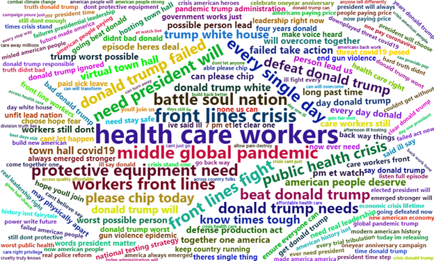
The wordcloud is formed from taking counts of the most groups of 5 words.
The sentiment graph is taken using a method that attempts to account for the use of negation eg not like is considered negative but like is positive.
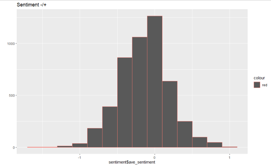
22/10/2020 midday EST Australia
“trump election”
Sentiment
5 word phases wordcloud

“biden election”
Sentiment

Wordcloud

Comparison of Biden and Trump tweets
The report on this research can be found at:
https://drive.google.com/file/d/13Cgne35F4OckDIP8iOfsBaLYuecFxPsY/view?usp=sharing
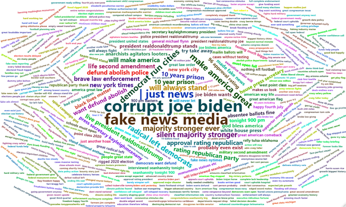
The two most interesting visualization are the wordclouds of three words phrases. Biden’s is first and then Trump’s.
Sentiment analysis showed only minor differences. However, the wordcloud’s show very different focus for both. Biden’s is characterised by more positive statements about issues and the need to defeat Trump. Trump’s on the other hand shows a strong focus on his slogans e.g. Corrupt Joe Biden.
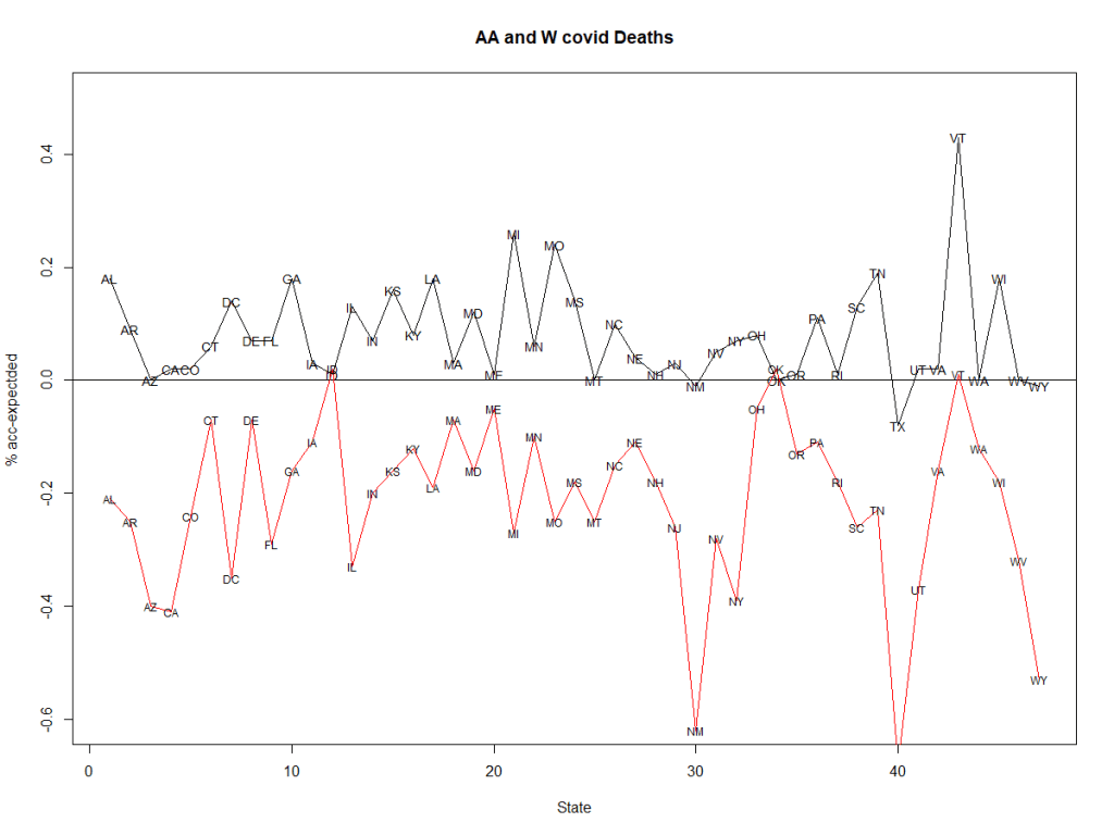
Latest White v Afro-American
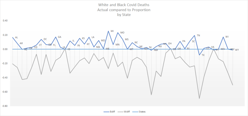
Shows the proportional effect on Covid Deaths. Above the line shows greater than expected based on state population proportion, below shows less than expected.
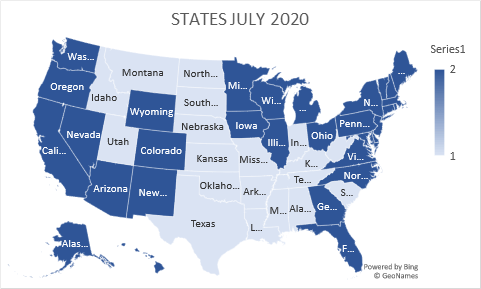
State of US Electoral College July 2020
Covid-19 US Race Investigation
The covid-19 death rate in the US is shown to have a statistically significant difference between between Afro-American (AA) and White ![]() populations. The graph below shows the AA proportion difference compared to the W proportion below the x=0 line. There is a clear difference across nearly all states.
populations. The graph below shows the AA proportion difference compared to the W proportion below the x=0 line. There is a clear difference across nearly all states.
The full outline, R program and data file are available at ameyenn/covid19
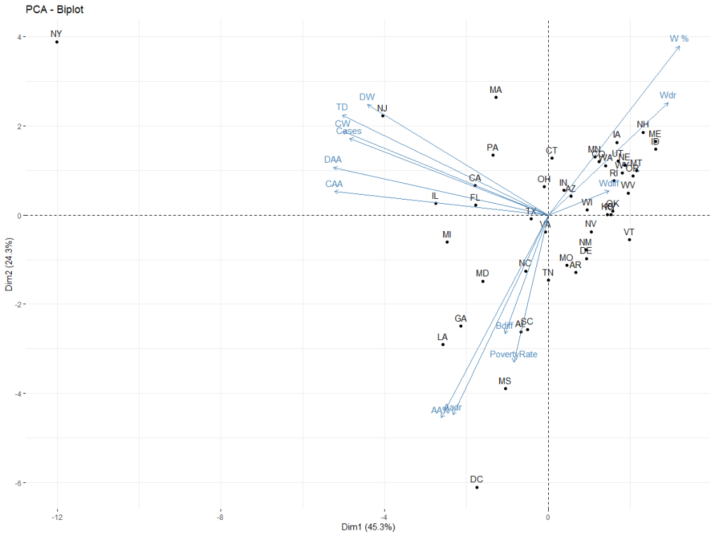
The PCA biplot confirms the difference. The vectors show a negative relationship between AA and W, AA is linked with the poverty vector as well. NY is the main outlier.
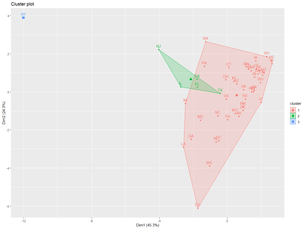
A basic cluster plot across all the data is shown below.
Welch Two Sample t-test
data: dt[, 1] and dt[, 2]
t = 3.7143, df = 80.722, p-value = 0.0003739
alternative hypothesis: true difference in means is not equal to 0
95 percent confidence interval:
0.3026568 1.0010984
sample estimates:
mean of x mean of y
2.688740 2.036862
