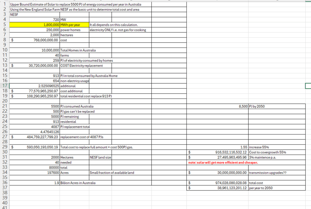
Note: the land estimate is just for the replacement of home electricity.
NESF is said to generate 6PJ (I think this is an overestimate for a few reasons) but let’s go with that. Thus 2000 hectares for each, need 5500PJ/6Pj = 916.
Extra costs are upgrades to Transmission – hard to know say $20B, and 3% maintenance per year.
Solar can be upgraded easily and there is no digging up and transportation, which reduces the amount of energy needed by around a further 15%.
The idea would be to obviously not do everything with Solar but to use some proportion of wind, hydro and biofuel.
Nuclear in the future could be used if the technology develops re: SMRs, and can be shown to work well, be cost effective etc.
Gas would still be needed to power very temperature manufacturing and for export for same process overseas.
Coal production and consumption domestically will reduce over time, but exports may continue for longer. The big problem for Australia is long-term replacement of coal export income, hence the need for new industries.
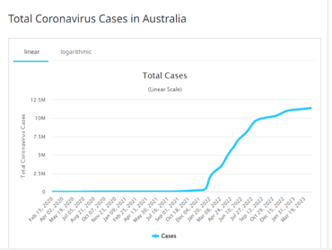
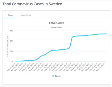
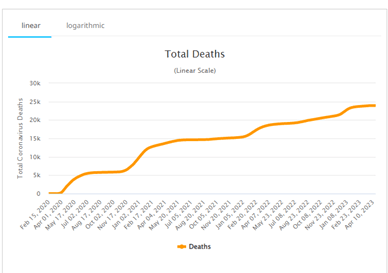
Sweden’s raw death rate is abut 24,000 and Australia’s 20,000, Sweden’s population is 10m and cases 2.5m on either proportion Sweden’s has vastly higher death rate.
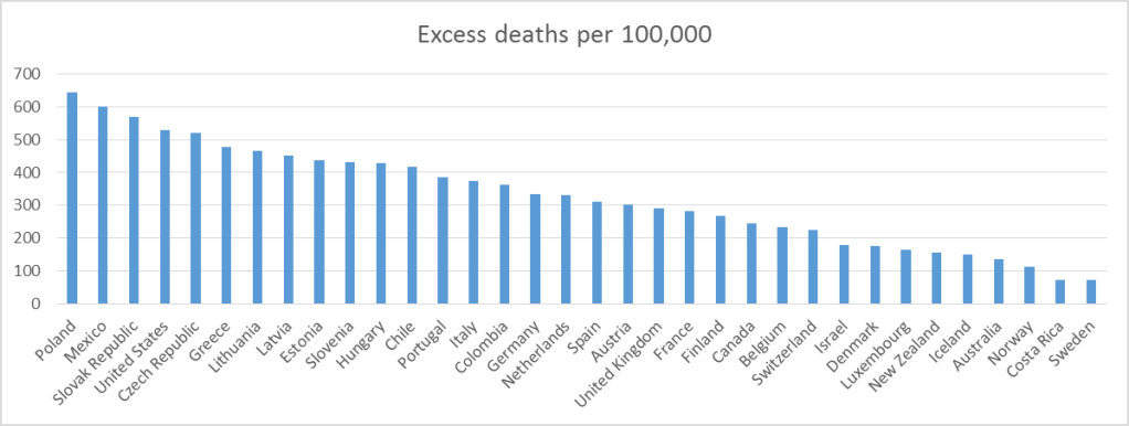
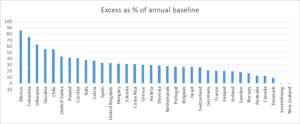
There is a lot of noise in sections of the media about significant difference in excess deaths, which is attributed to the different approach, the implication being Sweden has done vastly better.
A simple review of the facts simply do not support that thesis, and what’s more both do vastly better than most other countries.
I thought I might use the data in my teaching. The relative comparison of Australia and Sweden does not confirm that Sweden performed better. The actual death rate is higher compared to Australia and the excess death comparisons don’t suggest a major difference especially compared to the rest of the world. The Australian via Crichton, The Herald via Bolt et al. constantly try to suggest this Sweden line but they don’t in my view know what they are talking about. I have accessed the base data and have copied and the sources. Personally, I ignore most media reports as they don’t try to report dispassionately and always have a bloody angle eg Fox in the US and Sky here.
Australia Pop = 25.7m
Proportion of deaths Deaths/cases = 20000/11300000 = 0.001
Excess Deaths 2022 ~ 20000 (15% over long term)
Sweden
Pop = 10.4 m
Proportion of deaths Deaths/cases = 23928/2700000 = 0.008
See graphs below
OECD most recent roughly 6% v 3%, whilst Sweden best, Australia compares well with the rest.
Different data set and methodology for balance, data March 2023, here we see reversed result but both Australia and Sweden do well in comparison to rest.
Graph show the % excess deaths, Sweden has peaked and dropping, Aust recent data not available to me. The graph does not seem to support the idea there is a major difference between Sweden and Australia. If anything Sweden has some very high early peaks.
There is about The Voice, some reasonable about clarity and will it make a difference.
Marcia Langton has stated that The Voice will ensure advice is transparently tabled in Parliament, no more lost and ignored reports from the myriad of committees. This seems like a sound reason to support The Yes case.
Amazing what chatgt can come up with; seems to get to the points of the matter.
The arguments in favor of recognizing Aboriginal and Torres Strait Islander peoples in the Australian Constitution include:
Acknowledgment of Australia’s history: Recognition in the Constitution would acknowledge the history of Indigenous Australians and their long-standing connection to the land.
Addressing past injustices: It would recognize the injustices and harm caused by policies such as forced removal of children from their families, and promote reconciliation between Indigenous and non-Indigenous Australians.
Advancing Indigenous rights: Recognition could help protect Indigenous rights, and promote greater self-determination and decision-making power for Indigenous Australians.
Strengthening the nation: Acknowledging Indigenous Australians in the Constitution would contribute to a sense of national unity and pride, and enhance Australia’s reputation as a fair and inclusive society.
Supporting treaty negotiations: Constitutional recognition could facilitate the negotiation of treaties or other agreements between Indigenous and non-Indigenous Australians, providing a foundation for greater cooperation and mutual respect.
The Voice to Parliament refers to a proposed advisory body to the Australian Parliament that would represent the interests of Indigenous Australians. The arguments against the Voice to Parliament include:
It is seen as potentially divisive: Some argue that creating a separate representative body for Indigenous Australians could create division and resentment among the broader population. (this is possible, especially if the place of indigenous people is not acknowledged)
It is seen as unnecessary: Critics argue that Indigenous Australians already have various representative bodies, such as the National Congress of Australia’s First Peoples, and that creating another advisory body would be redundant. (possible point, but there is no reason why this should be the case, taking on-board Langton’s comment, it is likely to improve effectiveness and efficiency of advise getting actioned or at least formally dealt with.)
It could undermine the principle of equality: Opponents argue that creating a separate advisory body based on race could undermine the principle of equality and lead to calls for other groups to have their own representative bodies. (again, possible, but there is inequality now, dignity is lacking, there is no veto power not mandatory nature of advice, it is to give a rightful place to indigenous peoples, not as separate but as privileged as ‘here first and disposed’, about self-esteem.)
It may have limited impact: Some argue that the proposed advisory body may not have enough power or influence to effect meaningful change. (yes, possible but it would not be able to be hidden as easily)
It could be used as a political tool: There are concerns that the Voice to Parliament could be used by politicians for their own purposes, rather than to represent the interests of Indigenous Australians. (so what)
The arguments in favor of the Voice to Parliament, or an advisory body to the Australian Parliament that would represent the interests of Indigenous Australians, include:
Ensuring Indigenous voices are heard: The Voice to Parliament would provide a formal channel for Indigenous Australians to have their voices heard in the national policy-making process.
Promoting greater self-determination: The proposed advisory body would help promote greater self-determination for Indigenous Australians, giving them a say in decisions that affect their lives.
Enhancing decision-making: The Voice to Parliament would bring a valuable Indigenous perspective to the policy-making process, promoting more informed and effective decision-making.
Addressing historical injustice: The proposed advisory body is seen as a means of addressing historical injustices and recognizing the ongoing impact of colonization on Indigenous Australians.
Strengthening democracy: The Voice to Parliament would enhance democracy by ensuring that all Australians have a say in the decisions that affect them, regardless of their background or ethnicity.
Using the same data I have constructed the same graph – verified.
At first, glance that looks like a 15-year pause.
Research Question: Is it reasonable to conclude that there has been no increase in temperature in the USA since 2005, and what if anything can be said about the worldwide situation?
Based on the trend shown in the graph from 2005 it looks like there is an upward trend – see the higher highs, see the bunching effect near 2015-2022, but maybe I see incorrectly – biased.
Time series are hard to study. There are often trends that are hard to see.
One thing to do is consider a moving average and look at the yearly trend.
If we do this a trend is easier to spot. The lower average temperatures are increasing and the time period is shorter.
The top is fluctuating, much like the first graph. But you will notice that the trend line shows a positive gradient (i.e. the number in front of x)
The UAH is satellite reconstruction by Dr Spence and RSS is via a private firm. You notice the key thing is that they agree.
This is not a trick it is a simple well-used method to detect trends.
It is very clear there is an upward trend.
The full set of data from 1900 shows the entire trend.
This graph captures nicely the way the average has moved upward over time.
Initially, it was low, then there was a jump and then a fall and plateau and then a gradual rise.
What you will notice is these are both increasing and Min more it is more than Max. This is exactly what has been stated by climate science.
Heat Extremes
The trend is clear, extremes of heat is increasing.
Seasonal patterns
As I said earlier a time series is hard to study. A time series of data is made up of the raw data + trends + seasons + errors.
What is shown above is the seasonal data. Winter shows a clear trend.
In conclusion
I have recently completed a study of the time series data for the Arctic Sea Ice Extent ie how much ice there is at any point in time. The data is derived from Satellite readings since 1978. The basic finding is that the amount of the max sea ice has fallen from 16mk^2 to 14mk^2. It will get published in due course.
Back to the original research question. I think it is clear the original graph on its own does not present sufficient evidence that (a) warming is not or has not occurred in the US and (b) it says nothing about the world.
There is also much discussion on blogs about Urban Heat Island (and airports). The data that you see is adjusted to these effects. Raw data suggests a significant bias, which is why it is removed. Much of what humans do is set around bias either personal or hidden in the data. For this reason, researchers spend a lot of time detecting and removing it.