Comment of the US temperature data

The following graph was published and the source is wattsupwiththat.com

It is a snapshot from June 2005 to May 2022, taken from data available at the US Climate Reference Network: ref: https://www.ncei.noaa.gov/access/crn/qcdatasets.html

Using the same data I have constructed the same graph – verified.

At first, glance that looks like a 15-year pause.

Research Question: Is it reasonable to conclude that there has been no increase in temperature in the USA since 2005, and what if anything can be said about the worldwide situation?

Based on the trend shown in the graph from 2005 it looks like there is an upward trend – see the higher highs, see the bunching effect near 2015-2022, but maybe I see incorrectly – biased.

Time series are hard to study. There are often trends that are hard to see.

One thing to do is consider a moving average and look at the yearly trend.

If we do this a trend is easier to spot. The lower average temperatures are increasing and the time period is shorter.

The top is fluctuating, much like the first graph. But you will notice that the trend line shows a positive gradient (i.e. the number in front of x)

The UAH is satellite reconstruction by Dr Spence and RSS is via a private firm. You notice the key thing is that they agree.

This is not a trick it is a simple well-used method to detect trends.

It is very clear there is an upward trend.

The full set of data from 1900 shows the entire trend.

This graph captures nicely the way the average has moved upward over time.

Initially, it was low, then there was a jump and then a fall and plateau and then a gradual rise.

Let’s look at some other indicators

These can be found at https://www.epa.gov/climate-indicators

  1. High and Low temperature pattern

What you will notice is these are both increasing and Min more it is more than Max. This is exactly what has been stated by climate science.

  1. Heat Extremes

The trend is clear, extremes of heat is increasing.

  1. Seasonal patterns

As I said earlier a time series is hard to study. A time series of data is made up of the raw data + trends + seasons + errors.

What is shown above is the seasonal data. Winter shows a clear trend.

In conclusion

I have recently completed a study of the time series data for the Arctic Sea Ice Extent ie how much ice there is at any point in time. The data is derived from Satellite readings since 1978. The basic finding is that the amount of the max sea ice has fallen from 16mk^2 to 14mk^2. It will get published in due course.

Back to the original research question. I think it is clear the original graph on its own does not present sufficient evidence that (a) warming is not or has not occurred in the US and (b) it says nothing about the world.

There is also much discussion on blogs about Urban Heat Island (and airports). The data that you see is adjusted to these effects. Raw data suggests a significant bias, which is why it is removed. Much of what humans do is set around bias either personal or hidden in the data. For this reason, researchers spend a lot of time detecting and removing it.

Misleading discussion Climate graphs humansarefree.com

Misleading use of graphs- Humansarefree.com

US temperature Data

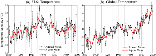
The graphs below show the 1999 published data from NASA. On left there seems to be no pattern on the right the global temperature anomalies show an increasing trend. Anomalies are measured by taking the difference between yearly temperatures and the 30 year average, see the Y-axis, 1.0 means that the yearly average was 1degree hotter than the 30 year average. In the US the temperatures in the 1930s were very hot over a wide spread area, this is the dust bowl period.

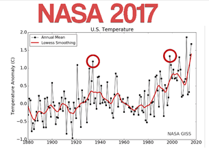
The NASA 2017 graph shows the same data but has the data from 2000 to 2018 shown and a statistical trend line.

Humansarefree.com make the claim that ‘this is significant scientific fraud’, there is no evidence for this and the trend shown should give rise to concern.

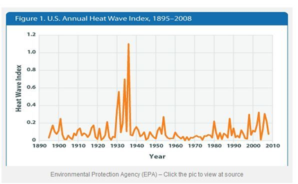
Heatwave Index

This graph is used to state that there is no discernable pattern of temperature and that it was hotter in the 30s.

The Y-axis is not easy to interpret, but bear in mind this graph shows HEATWAVE conditions only, defined to be above the 10 year average over four consecutive days. The graph does not enable you to say if the average temperature is increasing or is the frequency of hot days increasing.

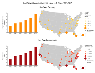
The graph is for temperature data across the US, the data shown on the following graphic is restricted to US cities.

The following graph shows that the frequency of heat waves and the length is increasing n US cities. (source https://www.globalchange.gov/browse/indicators/us-heat-waves).

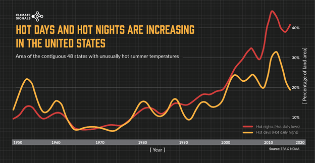
This graph below shows the change in hot days and hot nights shown as a percentage of land areas.

How do we interpret the graph? Hot nights are on the increase, there is recent dip in day time temperature coverage of land. The trend line is upwards.

Source http://www.climatesignals.org/resources/hot-days-and-hot-nights-increasing-united-states

Finally, the clam 30,000 scientists are against climate change dates to a petition circulating since 1998, there are numerous fact checks on this and I feel at the minimum such criticism ought to be taken into account before making such claims. Certainly they made Hoax claim.

In conclusion, the data and discussion on the Humansarefree is misleading an does not attempt a sound analysis.

Andrew Bolt Misleading

Andrew Bolt’s Herald Sun Article 24/12/2018

Claim 1: Global Warming has slowed dramatically since last century, giving lower temperatures as compared to the climate models. (Source: Dr Roy Spencer – see http://www.drroyspencer.com/2018/12/the-five-questions-global-warming-policy-must-answer/)

First observation is what data is being used to make this claim and is it surface or lower atmosphere or sea surface data.

Spencer shows two graphs one for the surface and the other for the lower atmosphere.

http://www.drroyspencer.com/wp-content/uploads/Fig17-CMIP5-vs-obs-1979-2017-global-LT-550x413.jpg
http://www.drroyspencer.com/wp-content/uploads/Fig06-IPCC-models-vs-HadCRUT4-1979-June-2018-550x413.jpg

The graphs show temperature anomaly data, variation of average temperature from 30 year mean. The trend lines on the data show an increasing trend in temperature. Variations from year to year above the Yaxis 0 line indicate hotter.

I see no reason why one would conclude that there is evidence for global warming slowing, in fact, it continues the trend.

Turning to the accuracy of climate models, again I can’t see what the issue is here, the models indicate a similar trend. One would expect variance from actual data, is it a statistically significant difference. (see http://iopscience.iop.org/article/10.1088/1748-9326/aaf342/meta) for a nice balanced research article on the ‘pause’, which it refutes and discusses the statistical issue.

Claim 2: Global Warming is causing more and worse cyclones

This would appear a contentious area, an article in National Geographic (https://news.nationalgeographic.com/2018/06/hurricanes-cyclones-move-slower-drop-more-rain-climate-change-science/) makes an interesting observation about slowing speed and dropping more rain and rising sea levels will contribute to the intensity of storms increasing with the frequency decreasing.

This article gives a balance view and discusses the role of climate models (https://www.gfdl.noaa.gov/global-warming-and-hurricanes/)

The claim is misleading as it does not consider the broader view, and implicitly is dismissing the role of more sophisticated models.

Claim 3: Global warming is causing more drought, the IPPC claims there is no global trend.

The IPCC do claim on a global scale there is no evidence of increased drought based on climate change, but not on a regional scale. This aspect is discussed in the report and indicate areas like the Mediterranean and Middle east are experiencing man induced drought.

This is a blog article reference so caution is needed but it provides some interesting insights which deserves more investigation (http://catallaxyfiles.com/2018/12/05/ipcc-contradicts-experts-pours-cold-water-on-man-made-reversible-global-drought-hysteria/)

The claim is misleading and concludes that no systemic global change indicates that there can be no regional change.

Claim 4: Rainfall in Australia has increased in the last century

Here is the BoM report (http://www.bom.gov.au/climate/updates/articles/a010-southern-rainfall-decline.shtml) the key point is that trends are regional in nature not global, which is what the statement implies, that is the increase would impact all areas equally. The report from CSIRO make similar reading (https://www.csiro.au/en/Showcase/state-of-the-climate).

The following report (https://www.climatechangeinaustralia.gov.au/en/climate-campus/australian-climate-change/australian-trends/) indicates

“Rainfall averaged across Australia has slightly increased since 1900, with a large increase in north-west Australia since 1970. A declining trend in winter rainfall persists in south-west Australia. Autumn and early winter rainfall has mostly been below average in the south-east since 1990.(climatechangeinaustralia, p1)

The claim is misleading and ignores regional differences.

Claim 5: Global warming means less food

The evidence stated to refute this claim is the grain harvest have set records in the past few years, there is no source given. There are however many research papers and government sources which at the very least ought to have been considered to give balance.

See

The claim is not negated and does not consider the broader discussion.

Claim 6: Polar bears are becoming extinct.

Emotive issue. This recent article outlines a view that possible global warming with cause problems for the bears (https://news.nationalgeographic.com/2018/02/polar-bears-starve-melting-sea-ice-global-warming-study-beaufort-sea-environment/), whereas Crockford indicates an increase (https://polarbearscience.com/2013/07/15/global-population-of-polar-bears-has-increased-by-2650-5700-since-2001/)

Claim 7: Consensus (97%) is largely debunked

The claim is about the likely impacts of climate change, it is a good point. However, that has been the case all along and I can’t see why one would use the word ‘debunked’. It is a very complex area and such statements tend to trivialize the matter.

In support of the claim Lindzen is referenced, he is retired from MIT. He disputes the likely impacts, but his own colleagues disagree with him, a fact I suggest should be noted and discussed. https://insideclimatenews.org/news/06032017/climate-change-denial-scientists-richard-lindzen-mit-donald-trump

Curry (https://judithcurry.com/2018/11/27/special-report-on-sea-level-rise/) provides an independent research report on sea rise. It makes interesting reading, but is not conclusive and has not been peer reviewed, it is published by her private company. These latter facts should have been noted.

Claim 8: Australia cutting emissions is not going to have any effect.

This is of course true, Australia accounts 1.3% of emissions, with a proportion of 0.3% of the world’s population.

We also export a considerable amount of coal and iron ore to two of the worlds leading emission countries i.e. India and China.

We will suffer the consequences of climate change over which we have no control other than to (a) sensibly consider the matter and (b) encourage others to take action. The best way to do this is by setting an example. However, given our emissions intensive economy we have an enormous and costly adjustment to go through.

Claim 8: Refutes Phelps’ claim that Kiribati  and Tuvalu will disappear due to climate change.

Kench’s research supports refuting this claim.

In conclusion, Andrew Bolt’s has presented many of the claims before. What I have attempt to show here is that the claims are mostly misleading and do not consider the broader picture. The article takes sides and is not balanced, nor does it seek to take a balanced approach. There an implication that consensus exists that climate change is real, but suggests there less consensus about the significance of any change. The evidence provided mentions two individuals, one a retired academic whose colleagues have ALL rejected his claims, and one an independent company owner whose research has not been peer reviewed, at least as far as I could determine. Such evidence is not sufficient to support the main claim of the article.

Overall, the article is misleading and does not seek to add materially to the publics understanding, rather it deals in contestable generalities.

Open positive letter to Clive Palmer – Climate Change

Dear Clive,

Keith is a dear friend from Uni days, he is a paid up PUP member and he is concerned you get this right, too.
Please don’t discount Tim Flanery – he is an excellent communicator and I feel a positive conversation would help developing understanding and awareness…..Tim if I have made any inaccurate statements in what follows please correct me (us).
I am writing to you directly as I was both impressed and dismayed at certain things said to the ABC Insiders and in an interview with Tony Jones.
I am not involved in any political party or movement – I am however a concerned Australian, currently living in Vietnam and soon Istanbul.
And, before we start I am trying to help.
Your statement about 97% carbon in nature and 3% created by man, and the idea that carbon in nature can be reduced is simply impossible.
There is a fixed amount of carbon.
It is stored in various forms e.g. gas, fossils, underground coal gas and plenty more.
The carbon cycle is fundamental to why earth is livable.
Photosynthesis is main process by which the volume of carbon, CO2 is kept in balance not too much and not too little – plants (plankton in the sea being a significant part) recycle Co2 and output Oxygen that we breath – any threat to the oceans will be catastrophic.Along with the layes of atmosphere that filter light and heat rays, with the specific natural balance here we would all fry or freeze.
(a) The science is clear, irrefutable, CO2 lets in sun light but not the reflected heat rays coming from earth’s surface that in normal circumstance simple go back into space, if trapped we get increased heat.
(b) Increased heat is likely to cause increased cloud and water vapor, water vapor acts exactly in reverse, it reflects sunlight back into space but lets through (out)reflected heat from the surface of the earth -hence cooling can occur.
It is very complex in how things will play out, I can assure you the computer simulations are very, very complex pieces of mathematics, each model consistently shows dangerous patterns that we simply do not understand the likely outcomes off.
The 3% you refer to is the increase due to mankind burning fossil fuels.Man is not creating anything, we are simply converting carbon from one for to another, and upsetting the natural cycle, so there is build up, year on year.
Small amounts of CO2 over time are being added that the current natural carbon cycle can’t remove and store. NOTE: it is impossible simple DELETE or destroy carbon, it is simply converted into a different form and stored, and on very long time cycles.
This small amount is hence adding to and gradually increasing the level of CO2 in the atmosphere – and hence the risk of points (a) and (b) occurring is heightened, and also why the issue is referred to as climate change – we could get heating and/or cooling, it is likely however that (a) and (b) will not simple cancel each other out, but this could happen.
To the KEY issue – you cannot remove carbon, the amount is fixed. You can’t simply look at a forest, for example, and somehow remove and throw away carbon, this would be alchemy.
What one can do is to try and restrict the increase of CO2 into the atmosphere – there are many schemes – storing the gas underground, or finding alternative energy sources eg Solar power, and looking eating habits to reduce methane from cows!
And, what is missed in the debate is that CO2 is only one of many gases that we should be worried about.
Australia is a very highly skilled scientific country, what I suggest is getting behind the issue and prompting our science and turning this into industries that employees. The CSIRO is a fantastic institution, a world leader, and acts independent of but is dependent on  Govt funding. As are our fantastic Universities whose only way of thinking at the moment is to increase fees and further reduce the spread of the students able to go to University – intellect is equally distributed, women, men, rich, poor, ethnicity, none matter. The inequity of access to Australian higher education is appalling, notice nobody ever talks about the outputs i.e. the socio economic background distribution of graduates. Public education is and SHOULD be seen as an investment, a right and not one restricted to the rich.
Australia has not been good at turning our knowledge into high added value industries -it is far simpler to dig ore/coal/gas out of the ground and export it, and we have an ethical issue here in that we are directly fueling carbon release in other large population countries.
I strongly urge you to do what you suggest, get briefed, listen and above all understand. I am very worried if indeed you are treated with distain and not listen too or approached, maybe if I am proffer some advice – “ask, shut up, listen, think, then ask questions….you owe it to your party members to get it right and LEAD”
We are talking about a fundamental fact or set of facts, which if not understood invalidates comment, in that if the argument presented cannot be traced back to showing understanding, then it has to be discounted.
I urge you to understand and get behind Australian Science, help with the step of monetizing our knowledge to create industries of high value and employment. Many small companies, in a vibrant intelligent competitive yet cooperative environment is the way forward – none of this silly “you are a dick, not your are, ya f’wit” , lets move on, the current two party system and that ridiculous parlementray question time is anti intellectual, anti business and just a bloody national and international disgrace.
Also, your comment on the NBN is misguided too – at least in my view – Australia must have a highly efficient and fast data transmission infrastructure on which new industries can be built. I have run a very small business in the past educating teachers around the world how to teach computer science – the Internet and access to it via the world wide web has been simply breath taking in the speed of its development, think since around 1995 when the first browsers that were easy to use came about. Get behind Australian education and research and the creation of a backbone NBN.
What is then needed is competition from providers of services – this is were Telstra should not be allowed to operate, Telstra should simple deliver the access to the backbone, across ever part, no inequality.
Your comments about Aboriginal children was appreciated, it is an Australian disgrace!
Good luck and please get to grips with the issue and no more ill informed comment – I am equally amazed that the Insiders said nothing, it exposes their lack of expertise, and credibility rather they are simply interested in the gossipy side of politics and really have no qualifications to comment further.
Kind regards
Dr Andrew Meyenn